Logo size, an identity crisis

A common request design agencies get from clients is to “make the logo larger”.

Responding to that is not always a simple yes or no. It’s more of a “we could do that, but…”. There’s a little more to it.

To make or not to make your logo bigger. That is the question. It’s a legitimate inquiry and often has merit. But occasionally, there is no justification for such a request; it’s more so: just because “We think it should be that way”. ‘Just because’ is not a good way to make decisions when in comes to brand integrity across platforms.

After designing a beautiful new identity system, typically a team wants to show off their brand new logo and understandably so. When there is a hand-off, whoever uses the identity hopefully follows the brand guide. However, there is a lot to consider.

What size is too large?

Typically clients tend to lean towards making the logo much bigger than it needs to be. Emphasis is misplaced. The reason being, often – a customer has spent all of this time, effort and budget on this identity. In doing so, it’s best to think of using the logo as much as possible and as big as possible. But trust me, that’s not doing anything for you. For new brands, perhaps it has *some* sense to it for brand recognition initially. But even then, it’s a balance – since your logo is usually working with words, images and other moving pieces.

Other things to worry about

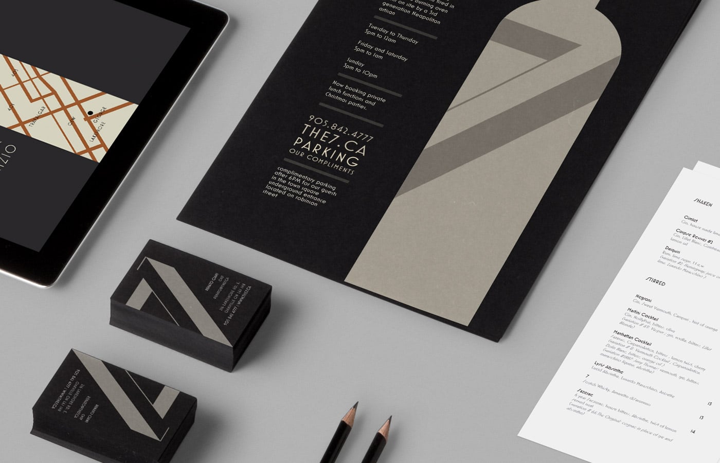
Besides the size of your logo, what else is there? There are more important things to focus on. Staying on track with your identity, though – we need to pay respect to the brand guide which should detail things like logo lockups, situational examples, spacing and any other considerations for use.

Using your indoor voice

I like to compare logo size to a conversation. Are you whispering, chatting, or shouting? And everything in-between. Because psychologically it’s easy to overdo it one way or another. There are unique situations when you need to scream and shout. In most scenarios that’s not going to fly.

Your logo needs to be balanced, dependent on where it’s being used. Make sure not to crowd the logo leaving adequate spacing. A tricky area can be on the web where you have limitations as far as the main navigation and header. This is where alternate logo versions come in handy should you need a horizontal, square or vertical stack.

Finding the right balance

If your logo is the most dominant item on the page, your logo might be too large. Unless that’s the desired effect, you’re overdoing it. What do you want your customers to see? Your logo, or the content? Regarding structure and hierarchy, consider what’s most important. It needs to be consistent (dependent on context). Is there enough contrast? How is the scale, proportionate to other elements? What sort of composition or layout do you have – how much room to work with?

There are multiple scenarios and situations where your logo will be applied. On signage, it should be large for visibility. On your website, perhaps it can be a little smaller. And that’s OK. There are other places you can blow it up to your heart’s content. Where do you need attention drawn to? A logo reinforces the brand; it doesn’t necessarily always have to be the hero.

Designer Bias

To be fair, as graphic designers, there are biases to having things neat, tidy and small. So perhaps we can meet in the middle and have a compromise. A reasonable size. Not too small, not too large. That’s all relative too, of course.

Let’s be reasonable. Your logo is great, let’s not bash your customer over the head with it. If your logo is the wrong size, one might notice something’s off but can’t quite put their finger on it! Think of the whole picture, don’t fall into the trap of fixating on one piece.

Put faith in your trusted brand advisor to make the right recommendations and help with those seemingly small but critical details.

So what is the best size for your logo? The answer is that it all depends.

Identity: Leaving Your Mark

Why does Nike have a swoosh?
Apple’s icon?
Starbucks siren?
CocaCola, no symbol “logo” to speak of?

OK, so we can’t all be Nike. But when it comes to your business identity, there is a lot to think about. Breaking it down into manageable pieces, we can understand the decision-making process behind a logo.

Anatomy of an identity

A logo is composed typically of a couple of components. Let’s start by looking at a logo and what it’s made of. Or better put – an identity. The face of your business.

Logotype

Your logotype is the word of your business visualised. As a typeface or “font”, the way it’s spelt out and arranged can influence the look and feel. Is it a serif or sans-serif? Modern or traditional. Is it UPPERCASE, Sentence Case or lower case? Maybe it’s not a font at all and it’s custom hand-drawn. What does that convey and does it feel like it represents your business? How about the letterspacing. Is the type thin or bold? What sort of arrangement needs to happen if any? In often cases a logotype can work on its own, or be more than enough and nothing else is required.

Icon

An icon is typically one image that works with or without the logotype. Usually a simple piece, it needs to work both small and large. If you’re a craft brewery, instead of showing the expected barley and frothy pint icon, maybe the icon ties into your bigger picture brand story – be it person, place or thing.

Alternative

Sometimes there is no one size fits all and you can use a series of setups that work together. A dynamic or “fluid” identity system.

A bigger question presents itself. Does your business need an icon? The short answer to that is, it all depends. Sometimes it comes naturally or sometimes; you need to get creative. It shouldn’t be forced and it’s not always easy to commit to one thing or another. Through the process, there are ways at arriving at something that speaks volumes as a representational and critical part of your business image. You might not need one, but you very well want one. Distilling what your business represents into one mark is the trick!

Thinking outside of the Literal, Laterally

What’s an identity anyway? A brand? A logo? What’s going on here, what’s up with these company’s logos?

If you look at those marks by themselves, they don’t say a lot. They are simple. Iconic. Representational. How can an apple icon represent a product company (well, that’s a long story) but you get where I’m going with that one. It’s about the idea.

What if I told you, say, perhaps if one owned a dental practice – they didn’t need to use a tooth as their logo? Form can transcend function – gleefully dazzling our imaginations in the abstract. Literal thinking is entirely different from lateral.

How else you can you show something that’s ‘all been done’ before.

Look, not every logo needs to be clever. A straightforward approach serves its purpose. It’s to the point. And it shouldn’t feel forced. Literal can work if it’s practical or economical. But often we can do much better if we put a little more effort into it.

Having a good name can help a lot. Your identity could come together quite quickly. But when you need to push and dig a little deeper, it’s an involved exercise.

Identity as a System

An identity is a system, developing a visual language that speaks true to who you are and what you’re all about. It includes images, icons, colours, tone, and dare we say – a gut feeling. The best brands speak to us somehow. And don’t forget – as cliche as it is – a brand is not what you say it is. It’s what your customer believes you are. And the savvy consumer knows when you’re trying too hard, or you’re a wolf dressed in sheep’s clothing.

Want to sell high-end products? Better invest in some design. Simplicity can be harder than it looks. You have to edit, commit and run with it.

Don’t be fooled into spending all your time and effort into the logo. It doesn’t stop at your identity. There is no literal representation of what the brand or business is or does. Not the logo by itself. A logo is one aspect of how a company defines itself.

Identity is one piece

Not many brands are represented by any one single piece or part, but by all of its pieces, working together.

A brand is not always necessarily tangible. In the sense that you often get a ‘feeling’ from a product or service – your brand personified. It has personality. In one sense or another.

We could relate brand to a fundamental need we all require – shelter. When constructing a house, you’ll have a developer, partners, contractors and various parties involved to make it happen. There are specialists in architecture, engineering, framing, concrete, drywall, electricians, etc.

A team works together towards a goal to accomplish something bigger than themselves. Much like an identity is a critical piece of the brand puzzle. I’m not conflating what we do with anything overtly grandiose. But it’s an important part of your business. And if it’s done right, it lasts for many years to come.

Start Now

When you are ready to shift your focus inwards and be introspective, do not fixate on the details. Start with the bigger picture, even if you can only see what’s in front of you, today.

Now is the time to start thinking about your identity and brand as a whole. From scratch or a redesign. Sometimes all you need is a little refresh.

Loading icon

Stripe Test

Hidden

Next Steps: Install the Stripe Add-On

To accept payments on this form you will need to install the Stripe payment add-on. Important: Delete this tip before you publish the form.
This is my super awesome product. It's the best, so everyone should buy it!
Name
Billing Address

Complementary consultation

Select a date and time below to book a 30-minute, no-obligation business branding session:

"*" indicates required fields

This field is for validation purposes and should be left unchanged.

Newsletter Signup

Get the latest from Jackson Wynne to your inbox

  • This field is for validation purposes and should be left unchanged.